The Thameslink Trainline Map, A Very Large Traintrackr

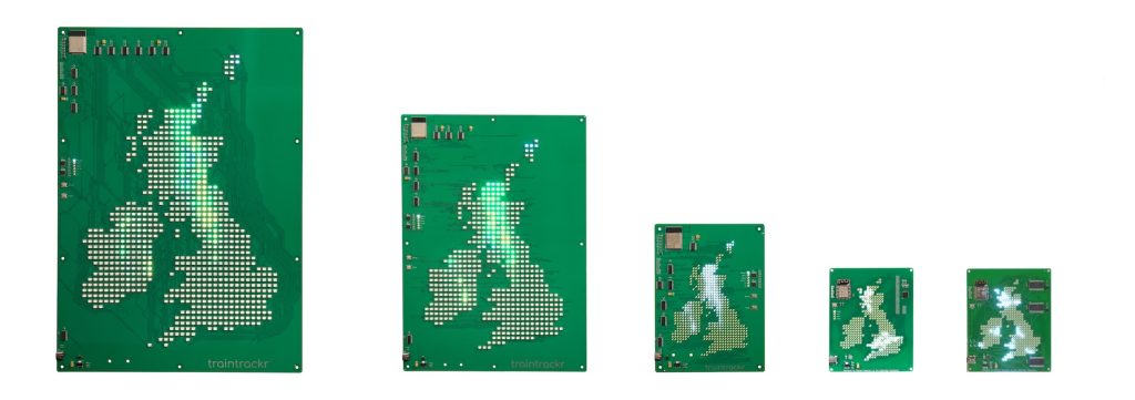
Internally we’ve been talking about larger traintrackr products for a while now, our biggest is currently the Large London board at 300mm x 400mm, but we want to go bigger. We do have some products in development that are bigger than this, but they are still going to fit in your living room.

Last year we were approached to make a very large traintrackr for the new Trainline office in central London, which was a good opportunity to build something big. We had a couple of conversations and some ideas were thrown around. Their first suggestion was to build a map 10m wide and 3m tall, all from circuit boards, showing all the trains running in Europe.

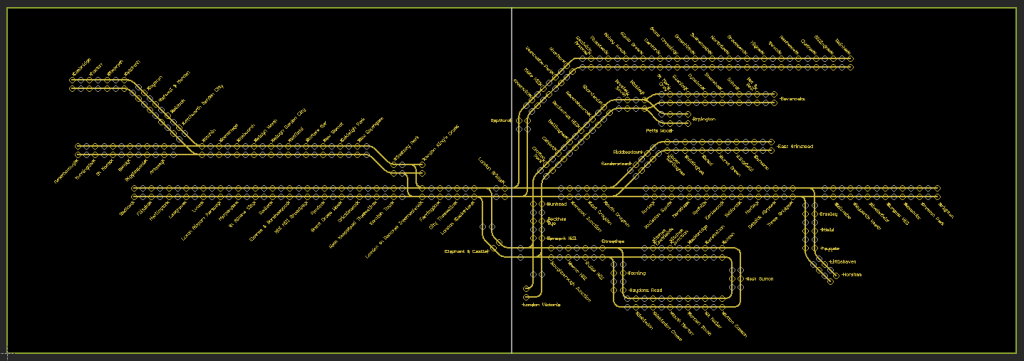
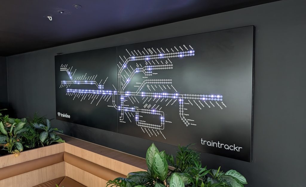
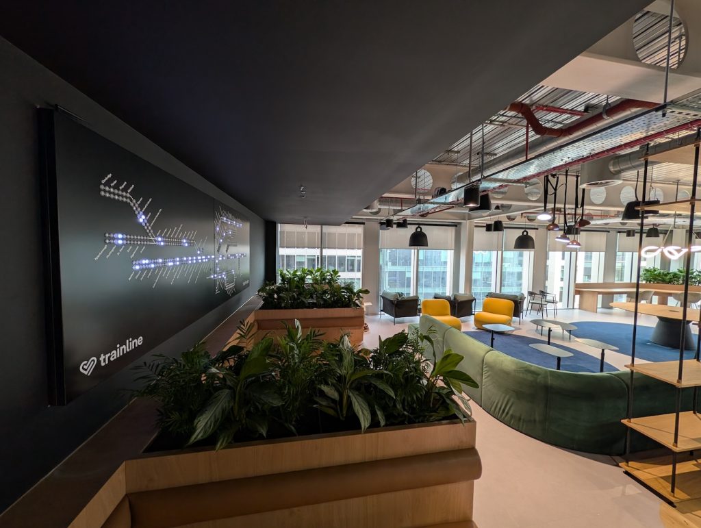
Thankfully we managed to get the project down a manageable scale, and settled on a map of the Thameslink network, on a 3.5m x 1.2m metal enclosure using 20mm RGB LEDs. This was doable, it suited their budget, it wasn’t going to take years to complete, and it involved a very well defined transit map.

Thameslink is a national rail route, and so we first had to get access to national rail live train arrivals. Like every other transit network they used their own unique APIs and schema. The one we chose was a SOAP API, and gave us departure board data for each station. This we could process to get the location of all the trains on the Thameslink network, and form the base of our live map. Once we had the data, and the map layout from thameslink, we were able to draw out the design in CAD and spec out the metalwork.

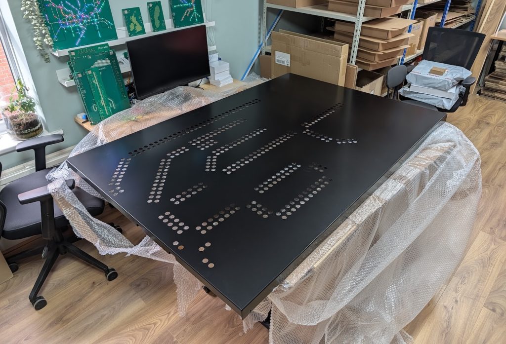
The spec called for a 3.5m wide metal enclosure, but with a service elevator measuring only 2m long (and a 1.75m powder coating limit with the metalwork manufacturer) we had to split this into 2 enclosures measuring 1.75m each, mounted side by side. The final metalwork consisted of two metal frames mounted to the walls, and then 2 metal doors on hinges, that would have the holes for the LEDs.

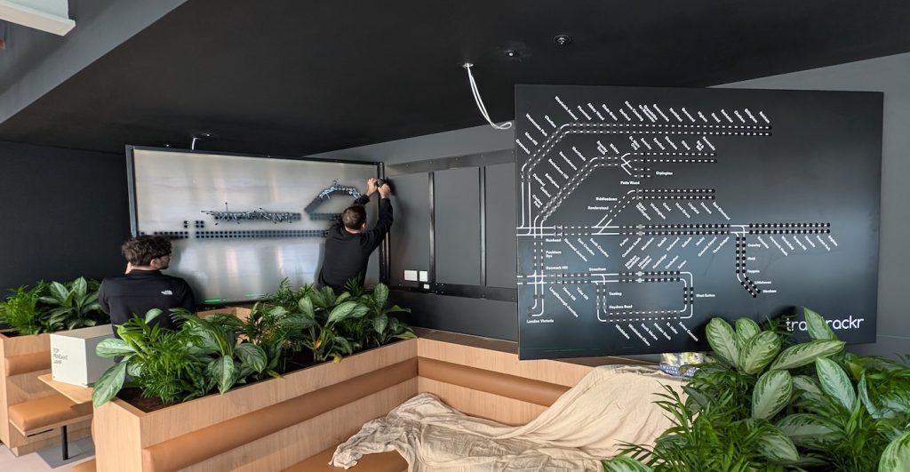
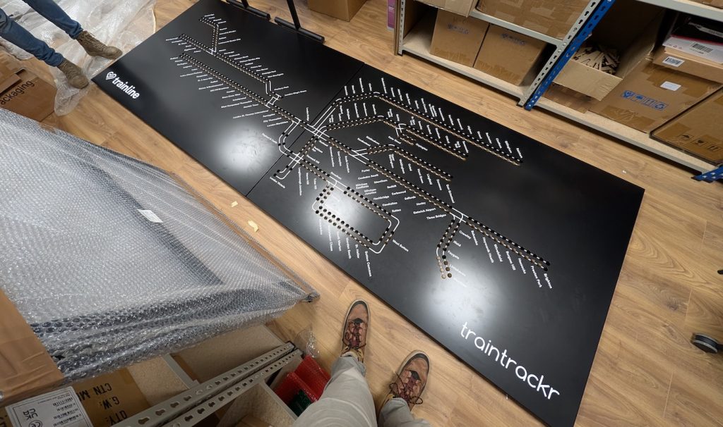
The lines and station names were added in white vinyl at our office, before we took the complete set of parts up to London for the install. Once attached to the wall we installed the 560x LEDs, and wired everything together. The processor part of the circuit board we installed, including the firmware, is very similar to a regular traintrackr, it’s just the scale of the LEDs that is significantly larger than our current lineup of products.

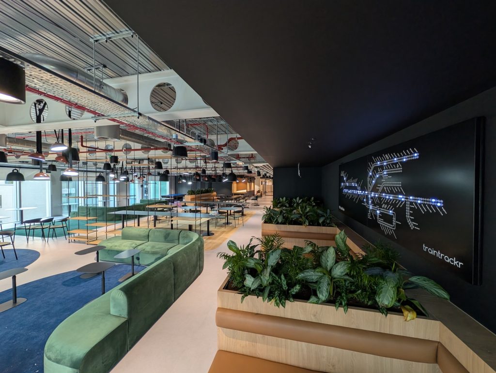
Everything went to plan, and we’re really happy with the way it came out. The white lines and text contrast well with the black powder coated enclosure, and it’s fun seeing a live traintrackr so large.

If you are interested in a large traintrackr like this then let us know. For those of you interested in something just a bit bigger than our current products, keep an eye out later this year.

New Rain Data

We’ve built a few map trackrs over the years, starting with our original uk rain trackr, later expanding to additional countries, and adding higher resolutions and colour LEDs. We’ve also added multiple layers to our newer maps, letting you select which data you want to display, from our original rain layer, to snow, wind, cloud, and temperature.

Unfortunately, the company we were using for our rain information have decided to shut down their api, so we’ve had to look for an alternate service to get rain map tiles. We’ve chosen to switch to weatherbit, and have been successfully testing the new integration into our system.

There are a few advantages to using weatherbit, they give us more consistent data then before, and better coverage, meaning we can now display rain information for the shetland islands in the UK for the first time. While we were migrating data providers we also had a look at the way we were processing colours, in an effort to display precipitation more accurately.

For the standard precipitation layer on our colour maps, we look at the area covered by each LED, and select the most common colour for that LED to display. So if an area consists of 40% light rain (green), 30% medium rain (yellow), and 20% heavy rain (red), the LED would light up green.

We’ve now added a new visualisation layer which shows the most extreme weather for each LED. For the above example the LED would turn red, letting you know there is heavy rain in that area.

By default we’ll always display the standard rain layer, showing you the most common colour, but now you’ll have the option to display the most extreme precipitation condition we can see in that area.

Because we’re using a new service, the colours we are displaying have changed slightly, below is the colour chart for reference, including ice and snow.

Connectivity Troubleshooting: Dual-Band Routers and Band Steering

If you’re having trouble setting up your Traintrackr, confirming that your Wi-Fi network meets Traintrackr’s compatibility requirements can help resolve connection issues. This guide explains the differences between single-band and dual-band networks, how band steering can impact setup, and offers troubleshooting steps for adjusting router settings to ensure a stable 2.4 GHz connection for your Traintrackr.

Wi-Fi Signal Basics: 2.4 GHz vs. 5 GHz & Single-band vs. Dual-band

Wi-Fi routers communicate over 2.4 GHz or 5 GHz signals. Like many smart home or IoT devices, Traintrackr connects exclusively to 2.4 GHz Wi-Fi, which typically offers better range but lower speeds than 5 GHz. Most modern routers are dual-band, creating both 2.4 GHz and 5 GHz networks. However, some routers only broadcast a single 2.4 GHz or 5 GHz signal.

If your network name doesn’t appear during Traintrackr setup, confirm that your router broadcasts a 2.4 GHz signal. Traintrackr products cannot connect to 5 GHz networks, so if your network doesn’t appear during the “scan” step, Traintrackr won’t connect even if you manually enter network credentials.

Dual-band Routers: Separate vs. Combined Networks

Some dual-band routers create separate network names (SSIDs) for the 2.4 GHz and 5 GHz bands, allowing you to connect specifically to the 2.4 GHz network during setup. Other dual-band routers combine these signals into a single SSID and automatically direct devices to either the 2.4 GHz or 5 GHz band based on load and performance. This feature, known as “band steering” (also called “smart connect” or “intelligent band selection”), may need adjusting for Traintrackr setup.

Troubleshooting Band Steering Connectivity Issues

Traintrackr can usually connect to routers with combined networks, but band steering may cause connectivity issues if the router defaults to the 5 GHz band. Because Traintrackr requires a 2.4 GHz connection, redirection to 5 GHz can result in disconnection. Here are options to troubleshoot this issue:

  1. Assign Traintrackr to the 2.4 GHz Band
    Some routers allow you to set connectivity preferences for specific devices. If available, assign the Traintrackr to the 2.4 GHz band or disable band steering for Traintrackr only. This often requires identifying the Traintrackr’s MAC address (see instructions here) and allows other devices to benefit from band steering.
  2. Create a 2.4 GHz-Only Guest Network
    If assigning device preferences isn’t possible, create an additional network (e.g., a guest network) that broadcasts only on the 2.4 GHz band. This setup lets your router maintain dual-band functionality while offering a dedicated 2.4 GHz connection for Traintrackr.
  3. Disable Band Steering Temporarily
    If the above options are unavailable, disable the band steering feature altogether. This prevents all devices from being redirected between bands. After disabling, try reconnecting Traintrackr. If it successfully connects, you may re-enable band steering; however, Traintrackr may lose connection in the future when band steering is active.
  4. Separate Dual-Band Networks into Individual SSIDs
    As a final option, separate your combined network into distinct 2.4 GHz and 5 GHz SSIDs. Note that changing SSIDs may temporarily disconnect devices on your network. After separation, reattempt the Traintrackr setup on the new 2.4 GHz network.

Each troubleshooting step may vary by router model. Some settings may be accessible via your router’s app or through a web portal using your router’s IP address. Contact your ISP or router manufacturer for assistance if needed.

Locating your Traintrackr’s MAC Address

For networks with MAC address filtering enabled, identifying the Traintrackr’s MAC address may be required to securely allow it onto restricted networks, such as those in universities or offices with advanced network security features. Many organizations require MAC addresses to manage which devices can connect to their WiFi networks, and some have strict filtering rules to prevent unauthorized access. Additionally, if IT support is needed during setup, the MAC address can help them locate the Traintrackr on the network or troubleshoot any connectivity issues. Having access to this information ensures that your Traintrackr is set up correctly, operates seamlessly, and displays real-time train data as intended.

To find the MAC address of your Traintrackr device, follow these steps:

  1. Put Traintrackr into Setup Mode: 
    • Press the “Setup” or “Flash” button on the board to activate the Traintrackr’s Wi-Fi network
  1. Connect to the Traintrackr Wi-Fi Network: 
    • Use your computer, tablet, or phone to connect to the “Traintrackr” Wi-Fi network.
    • Ensure that your device is connected to the network before continuing
  1. Open your web browser and navigate to 192.168.4.1
    • The Traintrackr WiFiManager page should appear
    • The page may take longer than expected to load
  1. On the WiFiManager page, click “Info”
    • Scroll down to the “WiFi” section
    • Your Traintrackr’s MAC address will be listed under Station MAC

Ensuring Your Board Stays Illuminated

At Traintrackr, our mission is to keep your boards brilliantly lit with the most up-to-date information from transit networks, weather providers, and other dynamic sources. We understand how important it is for your board to remain an engaging centerpiece, continuously displaying live data.

Occasionally, external data providers may experience temporary interruptions (like when Transport for London addresses a security incident affecting their live feeds). To ensure your board remains active during these rare moments, we’ve developed a feature that allows your board to display alternate data. This means your board can seamlessly showcase previously recorded information from prior weeks or months until the live data feed is restored.

How It Works

  • Automatic Activation: When a live data feed experiences issues, your board can automatically switch to alternate data, keeping your display consistently vibrant.
  • User Control: You have the flexibility to enable or disable this feature anytime by visiting your Traintrackr dashboard, selecting your device, and clicking the ‘Alternate Data’ button.
  • Status Updates: Check your current data status on your device dashboard. The status box will indicate one of the following:
    • The board is displaying live data with a healthy data source.
    • The board is displaying live data, but alternate data is available due to minor issues.
    • The board is displaying alternate data because of temporary live data interruptions.

While the alternate data feature is currently in an experimental phase, it’s designed to ensure your board remains a constant source of information and enjoyment. In the rare case we’re replaying data from a period that had its own gaps (due to past data issues or scheduled maintenance), those gaps might briefly reappear. However, we’re continuously improving this feature to make it even more seamless.

Rest assured, our priority is to display live data whenever it’s available—which is almost all the time. This feature is simply an added layer of reliability, so your board stays illuminated and engaging, regardless of external data fluctuations. Thank you for being a valued part of the traintrackr community. We’re dedicated to ensuring your product remains a timeless addition to your space.

TFL Data Outage

We rely on data from TFL to populate our London Underground live maps, currently we are getting no data for the majority London’s tube lines. TFL have told us this is connected to the ongoing security incident they are responding to, which you can read more about here – https://tfl.gov.uk/campaign/cyber-security-incident

Although our London Underground boards aren’t lighting up as they should, this is a problem with our data sources, and not the boards themselves. As soon as we receive data again from TFL our boards will light up again.

The Guardian go into a bit more detail on what is going on here: https://www.theguardian.com/uk-news/article/2024/sep/06/transport-for-london-cuts-data-feeds-to-travel-apps-citymapper-amid-cyber-attack

To check on the status of our data sources (including seeing how many arrivals we are receiving for each line), you can check our status page – https://www.traintrackr.co.uk/status

There currently isn’t anything we can do to speed this up, so for now we have to wait for them to complete the work and get us connected again.

Update: We’ve built a temporary solution to the problem

New Colour UK Maps

We’ve introduced 3 new UK map products this autumn, two of which are now using colour LEDs. Our large map has 768 LEDs, and our medium map has 512. Both can display a range of different environmental information, selectable on the product dashboard.

For precipitation, each LED varies in both colour and brightness, to give more accurate information about the type it’s displaying.

The intensity of the LEDs is directly related to how much of that part of the country is experiencing precipitation.   So a bright LED means most of that area is experiencing precipitation.

The colour of that LED then relates to the most common type of precipitation in that area at that moment, from the above chart.

Like our previous generation of maps, you can also enable animations, to show how the weather is progressing over time.

Update for additional layers

Cloud cover is represented on the board with varying intensity of white LEDs, over the range of 0% – 100% cloud cover.

Wind is also represented using varying intensity of white LEDs, over a 0-200m/s range

Our experimental temperature layer uses the following colours (temepratures in °C)

Traintrackr Products 2023-

Product NamePart NumberRelease Date
London Underground – Northern Linetfl-northern22023-09-01
London Underground – Elizabeth Linetfl-elizabeth12023-09-01
London Underground – Circle Linetfl-circle12023-09-01
London Underground – Metropolitan Linetfl-metropolitan12023-09-01
UK and Ireland Map Trackruk-map52023-09-01
UK and Ireland Map Trackr – Colouruk-map62023-09-01
UK and Ireland Map Trackr – Colour (Large)uk-map42023-09-01
New York City Subwaymta32023-09-01
Washington Metrowmata42023-09-01
Boston MBTAmbta92023-10-01
London Underground – Victoria Linetfl-victoria22023-10-01
London Underground (large)tfl62023-11-01
London Underground – Piccadilly Linetfl-piccadilly22023-11-01
London Underground – District Linetfl-district22023-11-01
Chicago “L”cta22023-12-01
BART – San Francisco Bay Areabart32024-02-01

Map Trackr Layers

Our first geographic boards were designed to show rain data, but it became clear that our customers wanted to display more than just rain, so we developed a new generation of ‘map trackrs’, which can show more than rain.

These new map trackrs have the advantage of individually dimmable LEDs (64 brightness levels per LED, rather than just on/off) which lets us display much more detailed information.

The geographic maps lend themselves to environmental/weather data, so we’ve added wind and cloud cover in addition to the original rain layer.

To change the layer your board displays, login to your dashboard, click your device, and then click ‘Map Layers’

This will then show you a modal with the avalibale layers for your map type.

In addition to the new layers, we also added the ability to animate the data. This cycles through the most recent 6 frames of data, ending on the most recent frame.

We update rain data every 15 minutes, so the rain animation shows 75 minutes of data.

We update wind and cloud data every 3 hours, so this animation shows 15 hours of data.

We’ll be adding more data layers in the future, what else do you want to see on your trackrs?