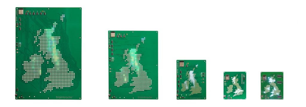
We’ve built a few map trackrs over the years, starting with our original uk rain trackr, later expanding to additional countries, and adding higher resolutions and colour LEDs. We’ve also added multiple layers to our newer maps, letting you select which data you want to display, from our original rain layer, to snow, wind, cloud, and temperature.
Unfortunately, the company we were using for our rain information have decided to shut down their api, so we’ve had to look for an alternate service to get rain map tiles. We’ve chosen to switch to weatherbit, and have been successfully testing the new integration into our system.
There are a few advantages to using weatherbit, they give us more consistent data then before, and better coverage, meaning we can now display rain information for the shetland islands in the UK for the first time. While we were migrating data providers we also had a look at the way we were processing colours, in an effort to display precipitation more accurately.
For the standard precipitation layer on our colour maps, we look at the area covered by each LED, and select the most common colour for that LED to display. So if an area consists of 40% light rain (green), 30% medium rain (yellow), and 20% heavy rain (red), the LED would light up green.
We’ve now added a new visualisation layer which shows the most extreme weather for each LED. For the above example the LED would turn red, letting you know there is heavy rain in that area.
By default we’ll always display the standard rain layer, showing you the most common colour, but now you’ll have the option to display the most extreme precipitation condition we can see in that area.
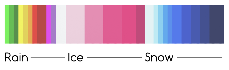
Because we’re using a new service, the colours we are displaying have changed slightly, below is the colour chart for reference, including ice and snow.