New Rain Data

We’ve built a few map trackrs over the years, starting with our original uk rain trackr, later expanding to additional countries, and adding higher resolutions and colour LEDs. We’ve also added multiple layers to our newer maps, letting you select which data you want to display, from our original rain layer, to snow, wind, cloud, and temperature.

Unfortunately, the company we were using for our rain information have decided to shut down their api, so we’ve had to look for an alternate service to get rain map tiles. We’ve chosen to switch to weatherbit, and have been successfully testing the new integration into our system.

There are a few advantages to using weatherbit, they give us more consistent data then before, and better coverage, meaning we can now display rain information for the shetland islands in the UK for the first time. While we were migrating data providers we also had a look at the way we were processing colours, in an effort to display precipitation more accurately.

For the standard precipitation layer on our colour maps, we look at the area covered by each LED, and select the most common colour for that LED to display. So if an area consists of 40% light rain (green), 30% medium rain (yellow), and 20% heavy rain (red), the LED would light up green.

We’ve now added a new visualisation layer which shows the most extreme weather for each LED. For the above example the LED would turn red, letting you know there is heavy rain in that area.

By default we’ll always display the standard rain layer, showing you the most common colour, but now you’ll have the option to display the most extreme precipitation condition we can see in that area.

Because we’re using a new service, the colours we are displaying have changed slightly, below is the colour chart for reference, including ice and snow.

New Colour UK Maps

We’ve introduced 3 new UK map products this autumn, two of which are now using colour LEDs. Our large map has 768 LEDs, and our medium map has 512. Both can display a range of different environmental information, selectable on the product dashboard.

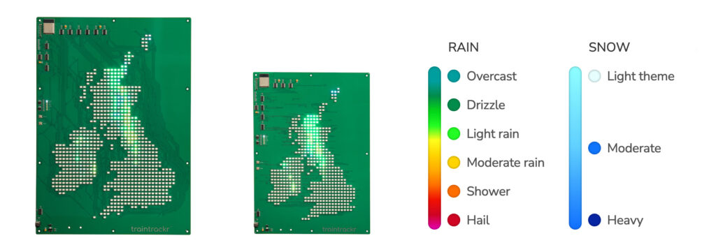
For precipitation, each LED varies in both colour and brightness, to give more accurate information about the type it’s displaying.

The intensity of the LEDs is directly related to how much of that part of the country is experiencing precipitation.   So a bright LED means most of that area is experiencing precipitation.

The colour of that LED then relates to the most common type of precipitation in that area at that moment, from the above chart.

Like our previous generation of maps, you can also enable animations, to show how the weather is progressing over time.

Update for additional layers

Cloud cover is represented on the board with varying intensity of white LEDs, over the range of 0% – 100% cloud cover.

Wind is also represented using varying intensity of white LEDs, over a 0-200m/s range

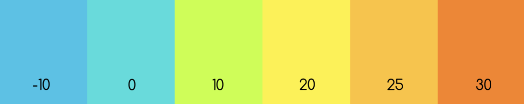
Our experimental temperature layer uses the following colours (temepratures in °C)